Setting Up a Data Science Environment with uv, Jupyter, and pandas
From a clean Python environment to interactive exploratory data analysis: a practical, reproducible workflow for data science practitioners using uv, JupyterLab, pandas, and Matplotlib.


Every data science project starts with a simple inquiry: What insights can we extract from this dataset?
Yet, before writing a single line of exploratory code, practitioners are often confronted with environment setup hurdles. You need a stable Python runtime, data manipulation libraries (pandas, numpy), visualization engines (matplotlib, seaborn), and an interactive scratchpad (JupyterLab). In traditional setups, managing these moving parts across global system interpreters, conda environments, and disparate package managers is a recipe for frustration. A common headache for newcomers is launching a notebook only to discover that import pandas fails because Jupyter opened under a different Python interpreter than the virtual environment where the package was installed.
In this tutorial, we will construct an end-to-end, reproducible data science workspace using uv, JupyterLab, pandas, and Matplotlib.
We will:
- Scaffold an isolated project sandbox using uv.
- Install analytical libraries alongside the interactive IPython kernel.
- Decouple the JupyterLab server from the project’s execution environment.
- Ingest and validate a real-world tabular sales dataset.
- Engineer derived revenue metrics using vectorized pandas operations.
- Compute group-level aggregations and comparative distributions.
- Visualize patterns through Matplotlib charts.
- Export structured outputs and preserve the environment for teammates via deterministic lockfiles.
1. Architectural Roles: What Each Tool Does
To build an intuitive mental model, let’s look at how each layer in our stack contributes to the workflow:
| Tool | Role in the Stack | What It Handles |
|---|---|---|
| uv | Environment & Package Manager | Fetches Python runtimes, creates .venv/, and resolves dependencies blazingly fast. |
| JupyterLab | Interactive Web IDE | Provides cell-based execution, inline table rendering, and visual exploration. |
| pandas | Tabular Data Engine | Manipulates structured DataFrames, computes aggregations, and handles time-series. |
| Matplotlib | Visualization Engine | Generates publication-grade 2D figures and bar charts. |
Rather than installing Jupyter globally or polluting system directories, uv serves as the unifying orchestrator that ensures our notebook kernel points directly to our isolated project dependencies.
2. Initializing a Dedicated Data Science Sandbox
Let’s begin by creating an independent project directory named data-lab. Keeping data experiments isolated guarantees that packages installed today will never conflict with other web scrapers, APIs, or machine learning pipelines on your computer.
Step 1: Confirm uv is Available
Open your terminal (PowerShell on Windows, or zsh/bash on macOS and Linux) and verify your installation:
uv --versionStep 2: Initialize the Project
Scaffold a new application project pinned to Python 3.12:
uv init --app --python 3.12 data-lab
cd data-lab
uv automatically constructs the project layout:
data-lab/
├── .git/
├── .gitignore
├── .python-version
├── pyproject.toml
├── README.md
└── src/
    └── data_lab/
        └── __init__.py
You do not need to run python -m venv manually; uv creates and manages .venv/ behind the scenes as soon as dependencies are added.
3. Installing Analytical Libraries
Our analysis requires three core components: pandas for data manipulation, matplotlib for chart plotting, and ipykernel to allow Jupyter to execute code inside this environment.
Step 1: Add Production Dependencies
Install pandas and matplotlib:
uv add pandas matplotlibThis command queries PyPI, resolves the entire transitive dependency tree (including numpy, python-dateutil, pytz, pillow, and kiwisolver), writes the resolved state to uv.lock, and synchronizes .venv/ in seconds.
Step 2: Add ipykernel as a Development Dependency
Next, install the IPython kernel:
uv add --dev ipykernelWhy mark
ipykernelas a dev dependency?
pandasandmatplotlibare genuine runtime dependencies required to process data. In contrast,ipykernelis a development bridge used while writing code interactively. Segregating development tools keeps your production footprint lightweight.
Step 3: Inspect the Dependency Graph
Verify what has been installed into your environment:
uv treeOutput:
data-lab v0.1.0
├── matplotlib v3.10.x
│   ├── contourpy v1.3.x
│   ├── cycler v0.12.x
│   ├── fonttools v4.55.x
│   ├── kiwisolver v1.4.x
│   ├── numpy v2.2.x
│   └── pillow v11.1.x
└── pandas v2.2.x
    ├── numpy v2.2.x
    ├── python-dateutil v2.9.x
    └── pytz v2025.x
4. Understanding Project Configuration (pyproject.toml)
Open pyproject.toml to review how uv structured our workspace:
[project]
name = "data-lab"
version = "0.1.0"
description = "Interactive exploratory data analysis lab"
readme = "README.md"
requires-python = ">=3.12"
dependencies = [
    "matplotlib>=3.10.0",
    "pandas>=2.2.0",
]

[dependency-groups]
dev = [
    "ipykernel>=6.29.0",
]
The Role of uv.lock in Data Science Reproducibility
Data science projects are notoriously susceptible to silent code drift. An analysis script written on pandas 2.1 might produce slightly different datetime parsing behavior on pandas 2.3.
By tracking uv.lock in version control, you ensure that every collaborator, research colleague, or CI server recreates the exact package state down to the specific wheel build and cryptographic hash.
5. Connecting JupyterLab to the Dedicated Environment
Here is the central challenge when using Jupyter with virtual environments: the JupyterLab web server and the notebook execution kernel can run in completely separate environments.
If Jupyter is launched globally, it defaults to your system Python interpreter—which knows nothing about the pandas package you just installed into data-lab/.venv.
To solve this cleanly, we register a custom kernel for our project, then launch JupyterLab on demand using uv’s ephemeral tool runner.
Step 1: Register the Project Kernel
Ensure the environment is synchronized:
uv syncNow register the kernel spec with Jupyter:
On Windows (PowerShell):
$venv = (Resolve-Path .\.venv).Path
uv run ipython kernel install --user --env VIRTUAL_ENV "$venv" --name=data-lab --display-name "Python (data-lab)"
On macOS and Linux:
uv run ipython kernel install --user --env VIRTUAL_ENV "$(pwd)/.venv" --name=data-lab --display-name "Python (data-lab)"This creates a lightweight JSON manifest under your user profile instructing Jupyter to run python -m ipykernel_launcher inside data-lab’s virtual environment.
Step 2: Launch JupyterLab Ephemerally
Rather than permanently installing heavy Jupyter packages into your system, launch JupyterLab directly via uv:
uv run --with jupyter jupyter labuv downloads a temporary Jupyter server environment in the background and opens the dashboard in your default web browser (typically at http://localhost:8888/lab).
Keep this terminal session active while you work.
Step 3: Create the Notebook
- In JupyterLab’s dashboard, create a new notebook.
- When prompted to select a kernel, choose Python (data-lab).
- Save the notebook as
sales_analysis.ipynbin your project root.
6. Preparing Sample Data: sales.csv
To keep our analysis self-contained and reproducible without external network dependencies, let’s create a representative sales dataset.
In your terminal or text editor, create a data/ directory and populate data/sales.csv:
date,region,product,units,unit_price
2026-01-05,North,Laptop,2,850
2026-01-07,South,Monitor,3,180
2026-01-10,East,Keyboard,5,35
2026-01-11,North,Monitor,2,180
2026-01-15,West,Laptop,1,850
2026-01-18,South,Keyboard,8,35
2026-01-20,East,Monitor,4,180
2026-01-22,West,Keyboard,6,35
2026-01-25,North,Laptop,1,850
2026-01-28,South,Laptop,2,850
2026-01-30,East,Keyboard,10,35
2026-01-31,West,Monitor,2,180
Dataset Schema & Column Definitions
The dataset contains 12 transactions across four geographical regions and three hardware product categories:
| Column | Data Type | Description | Sample Values |
|---|---|---|---|
date | Date (YYYY-MM-DD) | Transaction execution timestamp | 2026-01-05, 2026-01-31 |
region | Text (Categorical) | Sales territory identifier | North, South, East, West |
product | Text (Categorical) | Hardware item sold | Laptop, Monitor, Keyboard |
units | Integer (Discrete) | Quantity of items purchased | 1, 2, 5, 10 |
unit_price | Integer (Monetary) | Price per single unit in USD | 35, 180, 850 |
7. Interactive Analysis in JupyterLab
Now let’s step through our exploratory data analysis. Create distinct notebook cells for each step.
Cell 1: Importing Core Libraries
import sys
from pathlib import Path
import matplotlib.pyplot as plt
import pandas as pd
Press Shift + Enter. If the cell executes without warnings, your notebook is correctly talking to the project environment.
Cell 2: Sanity-Checking the Active Interpreter
Before loading data, verify that Jupyter is executing inside our project’s .venv:
print(f"Active Interpreter : {sys.executable}")
print(f"Python Version     : {sys.version.split()[0]}")
print(f"pandas Version     : {pd.__version__}")
Expected Output:
Active Interpreter : .../data-lab/.venv/Scripts/python.exe (or bin/python on Linux/Mac)
Python Version     : 3.12.x
pandas Version     : 2.2.x
Cell 3: Ingesting Tabular Data
Load sales.csv using pd.read_csv, instructing pandas to parse the date column:
data_path = Path("data") / "sales.csv"
df = pd.read_csv(data_path, parse_dates=["date"])
df.head()
Output DataFrame:
| date | region | product | units | unit_price |
|---|---|---|---|---|
| 2026-01-05 | North | Laptop | 2 | 850 |
| 2026-01-07 | South | Monitor | 3 | 180 |
| 2026-01-10 | East | Keyboard | 5 | 35 |
| 2026-01-11 | North | Monitor | 2 | 180 |
| 2026-01-15 | West | Laptop | 1 | 850 |
Cell 4: Validating Dimensions and Types
Inspect dataset shape and verify schema integrity:
print(f"Dataset Dimensions: {df.shape[0]} rows, {df.shape[1]} columns")
df.info()
Expected Output:
Dataset Dimensions: 12 rows, 5 columns
<class 'pandas.core.frame.DataFrame'>
RangeIndex: 12 entries, 0 to 11
Data columns (total 5 columns):
 #   Column      Non-Null Count  Dtype
---  ------      --------------  -----
 0   date        12 non-null     datetime64[ns]
 1   region      12 non-null     object
 2   product     12 non-null     object
 3   units       12 non-null     int64
 4   unit_price  12 non-null     int64
dtypes: datetime64[ns](1), int64(2), object(2)
Cell 5: Auditing for Missing Data & Duplicates
Before deriving statistical conclusions, confirm that no missing records or accidental duplicate rows compromise the data:
print("Missing values per column:")
print(df.isna().sum())

print(f"\nDuplicate rows detected: {df.duplicated().sum()}")
Output:
Missing values per column:
date          0
region        0
product       0
units         0
unit_price    0
dtype: int64

Duplicate rows detected: 0
Cell 6: Descriptive Statistical Summaries
Examine the numerical distribution:
df.describe()For units, average transaction size is:
print(f"Average units per order: {df['units'].mean():.2f}")Output: 3.83 units.
8. Feature Engineering: Calculating Revenue
The raw CSV tracks volume (units) and rate (unit_price), but not total transaction value. In pandas, we can compute derived fields through vectorized broadcasting:
df["revenue"] = df["units"] * df["unit_price"]
df[["date", "product", "units", "unit_price", "revenue"]].head()
Output:
| date | product | units | unit_price | revenue |
|---|---|---|---|---|
| 2026-01-05 | Laptop | 2 | 850 | 1700 |
| 2026-01-07 | Monitor | 3 | 180 | 540 |
| 2026-01-10 | Keyboard | 5 | 35 | 175 |
| 2026-01-11 | Monitor | 2 | 180 | 360 |
| 2026-01-15 | Laptop | 1 | 850 | 850 |
Because pandas operations run in compiled C/Cython, column multiplications execute without manual Python for loops.
9. Grouped Aggregations: Product & Regional Performance
A. Revenue Breakdown by Product
Which product drives the most business value? Let’s aggregate:
product_summary = (
    df.groupby("product", as_index=False)
    .agg(
        total_units=("units", "sum"),
        total_revenue=("revenue", "sum"),
        avg_units=("units", "mean"),
    )
    .sort_values("total_revenue", ascending=False)
)
product_summary
Output:
| product | total_units | total_revenue | avg_units |
|---|---|---|---|
| Laptop | 6 | 5,100 | 1.50 |
| Monitor | 11 | 1,980 | 2.75 |
| Keyboard | 29 | 1,015 | 7.25 |
Key Analytical Takeaway:
Volume and Revenue tell opposite stories.Keyboardaccounted for nearly 63% of all units sold (29 out of 46 units), yet contributed only 12.5% of total revenue. Conversely,Laptoprepresented only 6 total units sold, but generated 63% of gross sales ($5,100). Treating volume as a proxy for revenue is a classic data analysis trap.
B. Regional Breakdown
Now let’s compare geographic performance:
region_summary = (
    df.groupby("region", as_index=False)
    .agg(
        total_units=("units", "sum"),
        total_revenue=("revenue", "sum"),
    )
    .sort_values("total_revenue", ascending=False)
)
region_summary
Output:
| region | total_units | total_revenue |
|---|---|---|
| North | 5 | 2,910 |
| South | 13 | 2,520 |
| West | 9 | 1,420 |
| East | 19 | 1,245 |
The North region leads in revenue despite posting the lowest unit volume, whereas East moved the highest number of units with the lowest overall sales value.
10. Visualizing Trends with Matplotlib
While tables provide exact figures, charts communicate patterns instantly to stakeholders. Let’s plot our aggregated findings:
fig, (ax1, ax2) = plt.subplots(1, 2, figsize=(12, 4.5))

# Chart 1: Product Revenue
ax1.bar(product_summary["product"], product_summary["total_revenue"], color="#3b82f6")
ax1.set_title("Total Revenue by Product", fontsize=12, fontweight="bold")
ax1.set_xlabel("Product")
ax1.set_ylabel("Gross Revenue ($)")
ax1.grid(axis="y", linestyle="--", alpha=0.5)

# Annotate values above bars
for _, row in product_summary.iterrows():
    ax1.text(row["product"], row["total_revenue"] + 80, f"${row['total_revenue']:,}", ha="center", fontsize=9)

# Chart 2: Regional Revenue
ax2.bar(region_summary["region"], region_summary["total_revenue"], color="#10b981")
ax2.set_title("Total Revenue by Region", fontsize=12, fontweight="bold")
ax2.set_xlabel("Region")
ax2.set_ylabel("Gross Revenue ($)")
ax2.grid(axis="y", linestyle="--", alpha=0.5)

for _, row in region_summary.iterrows():
    ax2.text(row["region"], row["total_revenue"] + 50, f"${row['total_revenue']:,}", ha="center", fontsize=9)

plt.tight_layout()
plt.show()
Rendered Matplotlib Visualization:
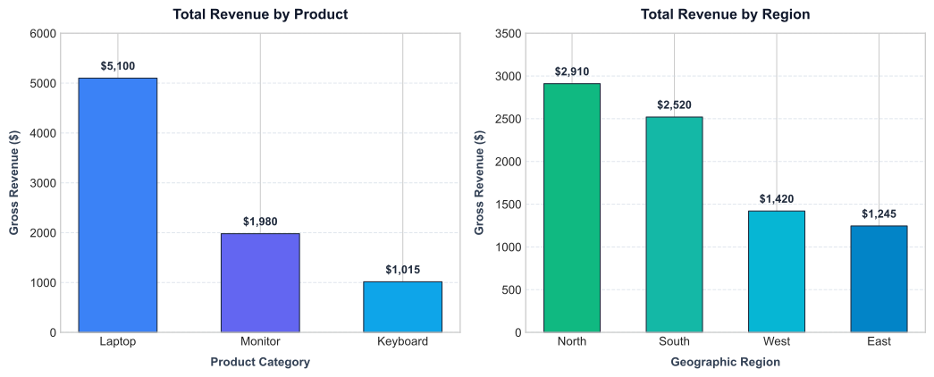
This single figure immediately conveys both product and territory performance side by side without needing to mentally cross-reference tabular numbers.
11. Exporting Deliverables
An exploratory workflow should seamlessly bridge into production. Save your aggregated summaries so they can be consumed by BI dashboards, downstream web services, or stakeholders:
output_dir = Path("outputs")
output_dir.mkdir(parents=True, exist_ok=True)

output_file = output_dir / "product_summary.csv"
product_summary.to_csv(output_file, index=False)
print(f"Exported clean aggregation to: {output_file.resolve()}")
Setting index=False avoids exporting pandas’ integer row counter as an unwanted extra column in spreadsheet software.
12. Reproducibility Checklist & Sharing with Teammates
When sharing this project via Git, ensure your repository contains:
pyproject.tomluv.lock.python-versionsales_analysis.ipynbdata/sales.csv
Setting Up on Another Machine
When a colleague clones the repository, recreating your exact computational environment requires zero guesswork:
# 1. Clone repository
git clone https://github.com/your-username/data-lab.git
cd data-lab

# 2. Rebuild the exact environment from lockfile
uv sync --locked

# 3. Register the local kernel (once)
uv run ipython kernel install --user --env VIRTUAL_ENV "$(pwd)/.venv" --name=data-lab --display-name "Python (data-lab)"

# 4. Launch JupyterLab
uv run --with jupyter jupyter lab
13. Common Troubleshooting & Gotchas
1. ModuleNotFoundError: No module named 'pandas' inside the Notebook
This almost always indicates the notebook is running against the default system kernel. Check the top-right corner of JupyterLab and switch the kernel to Python (data-lab).
2. Kernel Does Not Appear in JupyterLab’s Menu
Confirm that ipykernel was added to [dependency-groups].dev and re-run the ipython kernel install command from Section 5. Restart JupyterLab if necessary.
3. FileNotFoundError: data/sales.csv
In Jupyter notebooks, relative file paths are resolved relative to the notebook file itself. Ensure that sales_analysis.ipynb and data/ sit in the same parent directory (data-lab/). You can inspect your notebook’s working directory with Path.cwd().
4. JupyterLab Port Collision
If another background service occupies port 8888, Jupyter will automatically bind to port 8889 or 8890. Always open the exact URL printed in your terminal rather than hardcoding port 8888.
Summary
Setting up a robust data science environment is about more than just downloading Python packages—it is about computational clarity and repeatable engineering:
- Keep dependencies scoped: Manage analytical tools in an isolated project folder via
uv initanduv add. - Explicitly connect kernels: Decouple the JupyterLab server from your execution environment so your notebooks run against explicit dependencies.
- Lock everything: Use
uv.lockto guard against version drift and ensure reproducible results across teams. - Follow structured analytical steps: Ingest, audit data quality, derive features, aggregate by discrete dimensions, visualize distributions, and export results.
With this modern workflow, you can spend less time untangling conflicting environments and focus on what truly matters: deriving actionable insights from your data.
References & Further Reading
Related Articles
More writings on Data Science and related technologies.
Belajar Bahasa Pemrograman R: Visualisasi Data dengan Library ggplot2, Patchwork, dan Diagram Lanjutan
Kuasai ekosistem visualisasi modern di R berbasis Grammar of Graphics: eksplorasi mendalam ggplot2 dari konsep layering geom_*, faceting, custom theme, komposisi multi-plot dengan patchwork, hingga diagram aliran data tingkat lanjut (Sankey & Chord Diagram).

Belajar Bahasa Pemrograman R: Visualisasi Data dengan Plot, Barplot, dan Multiplot Layout
Pelajari seni visualisasi data menggunakan sistem grafik dasar (base graphics) di R: eksplorasi mendalam fungsi plot(), barplot(), pie(), hist(), boxplot(), hingga perancangan dashboard multi-plot 2x2 dengan studi kasus nyata.